
December 30, 2005
Warning: There are too many warnings
Warning: Extended reading of this blog on a computer screen may strain your eyes.
Daniel Fisher discusses warning-label overkill in Forbes after a consumer group complains that too many warning labels dilute their effectiveness.
 I couldn't agree more. My niece received a toy doll bed for Christmas; the less than one-inch square pillow had an attached label of nearly the same size. Is this saving lives?
Cars are terrible nags. Ugly labels are splashed across dashboards and sun visors, written lyrics to the awful chorus of electronic pings and beeps warning us to close the door, turn off the lights, and buckle up. And now it is getting worse. (Okay, now it is getting personal. But that is worse in my book.)
Our new Honda has a GPS navigation system with a disclaimer screen that comes up every time you start the car to warn you, in lots of words, that maps can be out of date. This would be annoying if it just showed every time. But you actually need to acknowledge it by pressing "Okay" before the system will come up.
Now I know that there will always be some idiot (or flustered elderly driver) who turns where there is no turn because the GPS said to. But there are lots of idiots driving on the road, and many more dangerous and likely threats to our collective safety than people turning onto non-existent roads because the little voice told them to. Why don't we have to acknowledge the danger of driving drunk, without a seatbelt, or while fiddling with the radio every time we start the car? Why don't we have to confirm that we’re not still parked in a closed garage before the engine turns over and starts spewing noxious fumes? And is pressing "Okay" enough? Sometimes my children press it for me – have I been warned? Shouldn't it require a signature or fingerprint?
The warning labels are there because because of government regulations and to defend against silly lawsuits. New labels will continue to follow new regulations and new silly lawsuits. The concept of personal responsibility is dead. Soon warnings like these will be a requirement, not a joke.
For the best of the worst warning labels, see M-LAW's Wacky Warning Labels or The Warning Label Book.
Posted by Bob Pritchett at 6:10 AM | TrackBack
November 27, 2005
Egg and Muffin Toaster
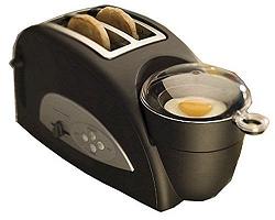 I think Seth has it wrong. In a world where time is short and our multi-function tools are over complicated, there is a place for a single purpose device that does one thing and does it well.
All you need for most cooking is a sharp knife, a covered pot, and fire. (Or a tin-can.) But good tools for specific tasks make things easier.
The single cup Brew ‘n Go Personal Coffeemaker is not right for offering coffee at dinner parties but it is perfect for a lone coffee drinker with a commute. In the same way the Egg and Muffin Toaster may not be for everyone, but it is perfect for somebody. And in a world where the simple, perfect iPod whipped a field full of do-everything media-player-radio-voice-recorders, I think that niches of focused utility are what many consumers want.
Posted by Bob Pritchett at 3:27 PM | TrackBack
March 31, 2005
The hotel alarm clock still isn’t fixed
Hotel alarm clocks are awful. It is hard to set them, hard to tell if they are already set, and hard to get back to sleep after they go off at 5:00 am because the previous guest didn’t turn off the alarm. (Or worse, left it set at 5:00 am in the empty room on the other side of a thin wall.)
Hilton just announced that they are rolling out 250,000 new, custom alarm clocks across their hotel brands. Features include pre-set radio buttons, a line-in for your personal MP3 player, and an easy-set alarm: it’s just three steps!
Are they kidding? Is this for real? After spending all that time and money they are going to give us an alarm clock that requires three steps to set and still requires the use of a time-down and time-up button to set the time?
Time setting appears to be the unsolvable problem in consumer electronics design. I would think that good solutions have been developed, and that designing the perfect alarm clock is an assignment in every Interface Design 101 class in the world. Are the good designs locked down with patents by companies unwilling to produce them? Are more buttons or knobs just too expensive?
This has to be the most thoroughly plowed ground in the world of design, but, since a chain as big as Hilton can still miss the mark (to the tune of a quarter of a million units) I’m going to lay it out again.
All the paired button interfaces (time-up/down or hour/minute buttons) require multiple presses, or a hold, in order to scroll through the time. You have to switch buttons or loop all the way around if you overshoot. Holding or repeatedly pressing a button on a lightweight little box takes two hands and too much patience.
One obvious interface would be a keypad. It is direct and fits the mental model: I want to get up at 6:45, I enter 6:45. Enter the time, and press the AM or PM button. Bingo, it’s set and clearly indicated on the display. The big, lit Alarm Off button turns it off.
If the keypad is too technical, use a knob. A knob allows easy and precise navigation for the typical small changes (7:00 am back to 6:45 am) while still making it easy for pre-dinner nappers to spin it quickly into the afternoon.
If the keypad requires too much software, and the knob too much hardware, how about some pre-set times? I’ll bet an analysis of wakeup call times shows that 80% or more of hotel guests are getting up between 6 and 9 am. 12 buttons labeled 6:00 am, 6:15 am, 6:30 am, … 9:00 am, could serve as one-step solutions for most guests. The time-down and time-up buttons already in use could be to the left and right of these presets, labeled Earlier and Later.
At home I have a wonderful alarm clock with a split LCD display. The large green LCD shows the current time and, if I press one of two light-up alarm buttons, the smaller orange LCD shows the alarm time. Pressing the lit alarm button turns off the alarm and the alarm time. It’s obvious and intuitive. Unfortunately the time setting is awful – you have to press a button to cycle through setting the clock time to get to the alarm time where you then use the paired time-down and time-up buttons.
I just found this knob based alarm clock, but it doesn’t appear to show the alarm time simultaneously with the current time. Can anyone point me to the ultimate digital alarm clock? Can you tell me what is wrong with my design ideas and why I haven't seen them?
Update: (05/11/05) This past weekend I stayed in a Hilton and used the new alarm clock. It works well, and isn't too hard to set, but I'm still disappointed that it does not feature a more innovate way to set the alarm time. I did like the genre buttons for choosing a radio station, though.
Posted by Bob Pritchett at 11:32 AM | TrackBack
March 6, 2005
The safer grill keeps burning me
When my dad bought a new gas grill, I was surprised to see that it had two handles mounted on the side of the lid instead of a long bar across the front. He explained that it was a safety feature that kept you from having to reach over the flaming grill to raise or lower the lid.
I grill all the time and never got burned until my dad got his new, safer grill. Now I keep reaching out for the missing front-mounted handlebar on his grill and burning my knuckles against the hot lid.
Why not both kinds of handle, Ducane? If the side-mounted handle really is a benefit – eliminating the need to expose their arms to the heat – customers will learn to use it and value it as a benefit of your grill. But without the front-mounted handlebar, the first few weeks with one of your grills will be filled with burns and annoyance, and customers risk having their guests despise rather than admire your product.
Designers of grills and software and everything else are always looking to make things new and different and better. It is important to respect the well established conventions, though, or else you risk getting burned.